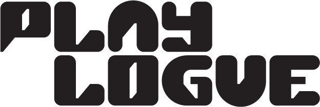
How we designed the custom font for our logo
as told by Oon Hong Quek, Hung Key and Iris Tang“We are Playlogue”—company name, check.
“We enrich conversations through games”—company tagline, check.
Having worked on these two areas in the founding of Playlogue Creations late last year and earlier this year, we began figuring out just what logo to pin our identity on. We knew we wanted to create a custom font for our logo and this is where we had a lot of fun playing with typography and graphic styles.
In the following anatomy of our logo, you will get a glimpse into our approach to branding and design: be it for game components or marketing collaterals, we like our icons and visual markers to be tools for storytelling.
Designing our icon
Much of the overall character of our logo came from deliberations over the design of the letter “P”, which would end up serving as our icon. We knew the shape of the letter would be a great backdrop for an image of a speech bubble to reinforce the name and tagline of our company.
As we worked on this icon, we had to ensure that its design could be applied to the other letters to form a coherent and unified font. To help us with this, we turned to the trusty old friend of designers: the logo grid.
A logo grid is used for geometric harmony between different visual elements. We used a 7x7 grid and added various parameters to suit our needs:
We wanted the outline of our “P” icon to be soft, meaning without sharp edges. So, we added circles at the corners to ensure that the “P” would have a pleasing curvature.
The tail end of the letter “P”, naturally, had a sharpness to it and required a different solution. We added small rectangles at the bottom left corner of the grid to play with the contour of the tail.
Tweaking the tail this way, we ended up with a triangular image that added a touch of whimsy to the “P” icon. In the process, we found the motif for our font and a visual marker of the “dialogue” part of “Playlogue”.
The “talking tail” motif
We called this motif the “talking tail”, since dialogue, as represented by the image of the speech bubble, begins from the tail end. The talking tail appears in negative space for every other letter of our logo and symbolises continuous conversation.
Together with the soft curve we mentioned earlier, the talking tail acts as a visual unifier for our font. With the grid as a backdrop for the whole logo, you can see how the letters can move around while having visual harmony.
Those shifting, stretching and colourful variants of our “P” icon represent the people we are privileged to have conversations with: gamers, game designers and all who see the value of games in telling stories.
Quiz time
Can you spot all the talking tails in out logo? How many are there? Share your answer in the comment thread below.
If you like our approach to graphic design and have a game you need help illustrating or branding, reach out to us at hello@playlogue.sg. You can also engage us for game design and consultation. For the full list of our services, click here.


![Playlogue_P-Bubbles_for-planning]-6-(6x4-movement)-v4-col-v2-with-grid(240521)2.gif](https://images.squarespace-cdn.com/content/v1/60376ff1e8de613542a75147/1621840744912-7UN9IX6OQHTPD99S3VMD/Playlogue_P-Bubbles_for-planning%5D-6-%286x4-movement%29-v4-col-v2-with-grid%28240521%292.gif)
