Merchant Trails Design Diary #1: Game Design Direction
With Merchant Trails out in the wild for a while now, we thought it’d be a good idea to sit down with one of its designers, Russell Wee, and find out more about how it was made!
Setting off on a journey
As with planning any journey, we started by figuring out where it was we wanted to go. Before I begin, I like to chart out what the boundaries of a project are; not only does it help prevent me wandering off the (metaphorical) map, doing so often also serves to kickstart my initial ideation.
In this case, our medium was fixed: one or more sheets of A4 printer paper. Since we wanted to give this game out as a freebie for joining our mailing list, we had to figure out how to actually get it into people’s hands – and a downloadable print-and-play made the most sense.
We also knew that we wanted something welcoming and relatively peaceful, with no swords, magic, or fighting in this game. That helped shape the sort of narratives I was thinking about, going into the design. Similarly, the game’s mechanics would ideally need to work with nothing more than a pen – meaning no dice, tokens, or other tracking bits.
Lastly, we also wanted a game that promoted table talk, and interaction. Both from a studio as well as a personal standpoint, I want to make games that nudge people towards each other. If people spend as much time laughing, talking, and jabbing each other as they spend strategising, that’s a good experience in my book.
Remembering Where We Came From
Given the above, the most interesting part of this design was obviously the main restriction: fitting a whole experience onto a single piece of paper.
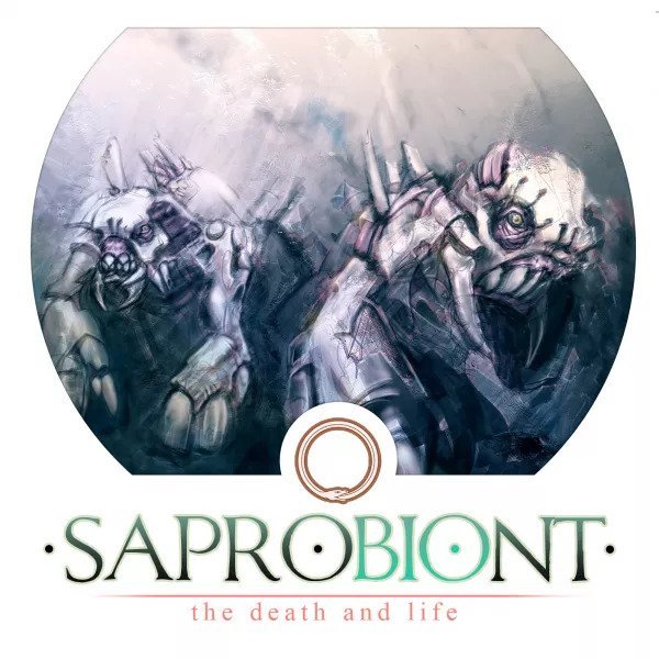
The print-and-play genre is an old and broad one, and I’ve got some fond memories of time spent printing and cutting out game components. This includes everything from janky solitaire dungeon crawls, to more polished affairs like Saprobiont.
As simple as Saprobiont was, I recall a solid evening where that was all my friends wanted to play, where we’d take turns debating and co-strategising who would (probably!) want to do what – only to react in surprise as the player in question proceeded with something we hadn’t quite seen coming. That was the sort of interaction we hadn’t quite expected from but a few simple sheets of paper, and I remember walking away impressed.
Saprobiont hence served as a distant inspiration when designing this game; I wanted something that felt like it was a larger game, that could bring the whole table together to mull over a shared board.
Eyes on the Road
Thinking about games like Saprobiont helped me orient the game vis-a-vis more roll-and-write-esque designs, which are (to me at least!) what normally comes to mind when someone says that they’ve “printed out a game”.
As much as I enjoyed the casual puzzling of something like Voyage or the old (non-boxed version of) Rolling Realms, I found that those games sometimes ended up being played in silence. While there are moments of “Hey guys, look at how much so-and-so is about to score!”, it’s often just as easy to end up with each player withdrawn into their own calculations. I knew I wanted something that prompted a little bit more looking around the table, instead of just down at your own stuff.
At the same time, we recognised the expectations players had of the genre. Where possible, we wanted to still capture some of the fun of optimising your own player sheet that a traditional roll-and-write does so well.
In some ways this then became the central pillar of the game’s design: balancing players’ attention between eyes-down and eyes-up modes of play. This interacted nicely with the generally relaxed theme of the game; given the conscious decision to avoid explicit conflict in the game’s narrative, I was already exploring conflict arising from resource management and scarcity. Relatively quickly then, we realised the straightforward solution was the best: it would be a resource management game, where a player’s deployment of resources could be a private affair, but acquisition would be highly interactive.
Arriving at the Destination
Once we settled on that design direction, everything else started to fall into place around it. Most notably, the game’s story came from us realising that we had an experience where everyone would be staring at a single A4 sheet of resources together; what better imagery than that of a group of merchants, bent over a trade map and studying its routes?
Early internal playtests with everyone focused on a central map.
From there, the theme came soon after: playing as a merchant along the greatest trade route of them all, the Silk Roads.
The second map for Merchant Trails: The Silk Roads is out now! Get it for free by subscribing to our newsletter.
Stay tuned for the next design diary where we dive into the game’s theme and how it enhanced its game mechanics.


